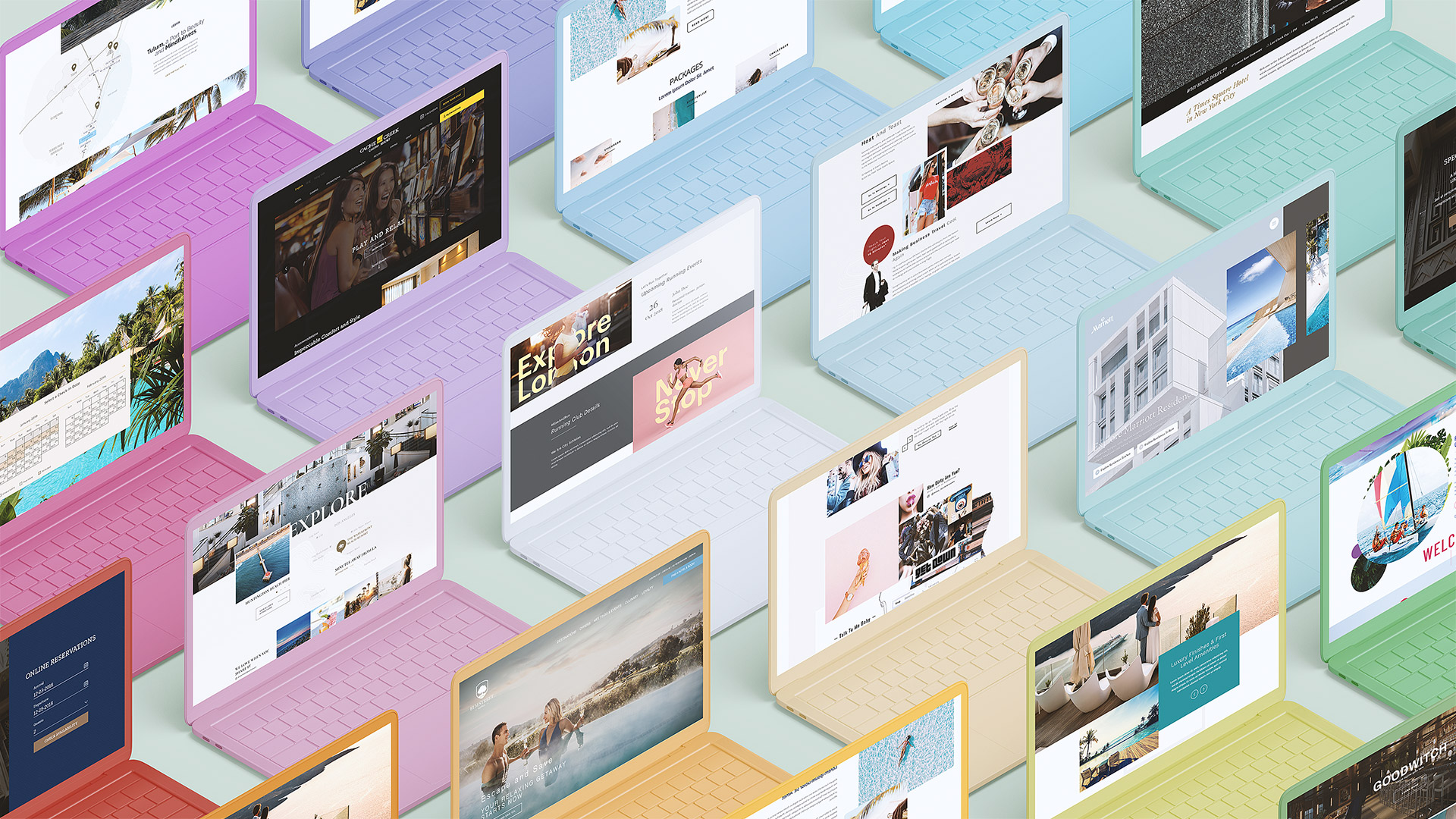
State of digital design in the hospitality industry
Web design is not a form of art, but a solution to a business problem, albeit with a bit of creative touch and artsy flavor. There are many different things hoteliers may want to achieve with their website, but at the end of the day it all boils down to one OKR – which is to convert website visitors into bookers. So how do we do that?
Everyone is a Goldfish
The age of smartphones, Netflix and Spotify, had affected humans in a way, that no scientist would have predicted. In 2019 it became more and more evident that users are suffering from a short attention span. According to recent studies humans are left with an attention span that is so short, that even a Goldfish can hold a thought for a couple of seconds longer.
What does that mean to me as a hotelier you ask?
It means that your website has precisely 20 seconds to capture users attention.
Let’s pretend like your current hotel website design company did a great job with regard to capturing attention, and now we have about 1 minute 30 seconds to inspire user’s curiosity.
Ok, we got users attention, we made them curious, now what? Now we need to convince them to make a booking and not on TravelClick or Expedia – but on your website. Sounds easy, right? Let’s get to meat and potatoes and see how we can make all of the above happen.
Capturing users attention through visually compelling photos and videos
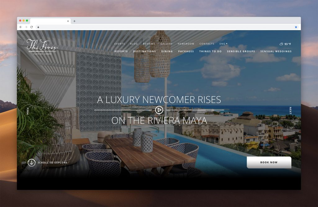
One of the most powerful tools at the hotelier’s disposal in this department is compelling visual assets. Great hotel video and photography is not a nice to have, but a must have as it is about storytelling. With the right photo, you can entice users to spend time exploring the website. With the right video, you can inspire curiosity, you can tell a story, you can set expectations for future experiences!
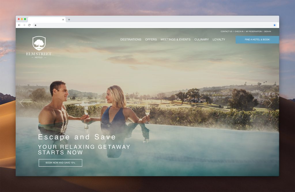
Both mediums are great for that, keep in mind that you have just 20 second – so do it right. Everyone is a photographer nowadays as well, but your assets should be done professionally.
Questions to ask yourself:
- Is there a wow-factor to an above the fold area of my website?
- Would it capture my attention if I would randomly land on this homepage?
- Does it make want to scroll down?
Tell your story with Organized Chaos technique
You need to tell your story in a way that is easy to digest but also irritates the user's visual tastebuds to a point where his appetite for travel starts to grow. Since the attention span of an average user is short (we remember, right?), we need to keep in mind that nobody reads texts on the websites anymore. We “scan” it, our brain “skims” texts – and in order to help our brain actually to get it, the website needs to provide us with simple visual anchors.
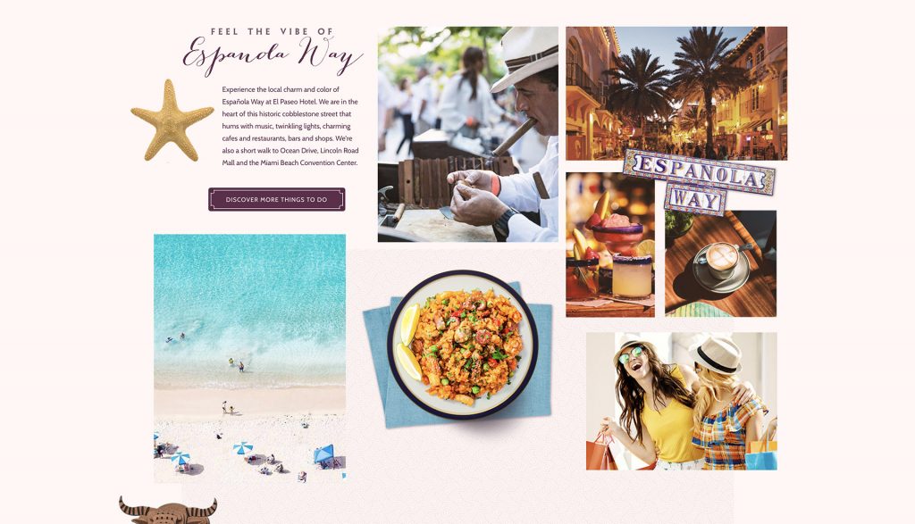
One of the best ways to do it is to use un-organized grid systems that I call Organized Chaos, other designers call broken grid layouts, or even Digital Mondrianism. In a nutshell, it is an invisible skeleton used by designers to place different design elements on the page. When users eye scans the page it does expect to see the same pattern of elements placement over and over again, and when that pattern gets broken user trips on it, and voila – attention grabbed! If used with caution this technique can excitingly tell your story and can help draw attention to a specific feature on your website.
Questions to ask yourself:
- Does your website communicate clearly what it is like to be on the property?
- Does it provide a feeling of what would the day look like if a guest is there?
- Does it give enough visual stimuli for the user to envision themselves on the property?
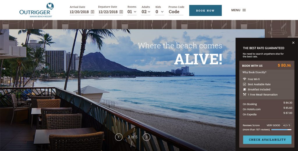
Close it now with Why Book Direct
Let me be frank, generally, customers aren’t really aware that the room rates of the hotel are most of the time are exactly the same as on any of the OTA websites for the same exact rooms. So be clear with your messaging, communicate the benefits of booking direct clearly. Explain what kind of perks customers will get if they will book direct, show all the additional benefits that customers may receive, demonstrate all of the fantastic amenities that will be at their disposal!
Questions to ask yourself
- Is it clear that the rate on the hotel website is at least the same as on OTAs?
- Does my website communicate the benefits of booking directly in an engaging way?
- If I would land on the website for the first time, will it convince me to book direct?
Reinforce Your Message
Third-party reviews can be a great tool to reinforce your message. Feeding independent guest reviews from sites like TripAdvisor, Yelp, Google may have a very good impact on how potential customers see your hotel. Just be careful – don’t feed just the positive reviews, having only 5-star reviews on your site raise a red flag almost immediately.
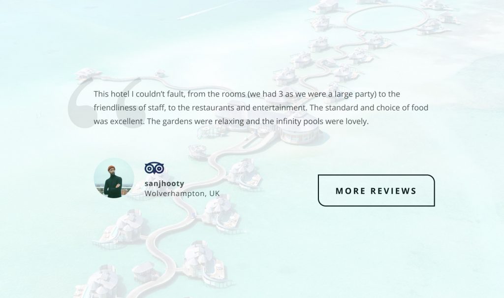
After all, no hotel is perfect, and sometimes some guests are just not good as well and they may leave a pesky review – have those as well. That will really give your customers a feeling that you are open and honest and if you allowed a bad review to appear on your site then you might as well be very truthful with all those fantastic photos and videos.